The Psychology of Color in Home Interiors
How Color Shapes Mood at Home
Warm Hues: Comfort, Energy, and Sociability
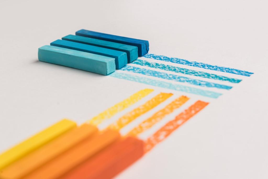
Reds, oranges, and sunny yellows tend to feel closer and cozier, subtly raising arousal and encouraging conversation. In living spaces and dining areas, these tones can invite guests to settle in, share stories, and stay a little longer. Tell us which warm shade makes your evenings glow.
Cool Tones: Calm, Focus, and Spaciousness
Blues and greens often slow the pulse and widen the psychological sense of space, making bedrooms, offices, and bathrooms feel serene and clean. They support focus without feeling sterile when softened with texture. If you crave clarity and deep breaths, consider a cool foundation and tell us how it shifts your day.
Neutrals and Earth Tones: Grounding the Senses
Taupes, soft grays, and clay-inspired browns provide visual rest between stronger accents. They steady moods, anchor heirlooms, and let artwork shine. When layered with natural materials, neutrals can feel richly alive, not flat. Share your go-to neutral and why it still feels timeless in changing light.

Living Room Conversations: Welcoming Palettes That Encourage Connection
A blend of warm undertones with grounded neutrals creates a hospitable hub for laughter and long talks. Think sand, cinnamon, and blush layered with textured textiles. Add one lively accent, like coral or terracotta, to nudge shy guests into conversation. Comment with your favorite living room palette that gets people talking.

Bedrooms and Rest: Soft Saturation for Deep Sleep
Muted blues, dusky lavender, and gentle sage cue the body toward rest. Lower saturation reduces visual noise, while matte finishes keep glare low. Pair with heavier drapery to dim evening light and maintain a soothing, cocoon-like feel. Tell us what color helped you unwind fastest after a demanding day.
Light, Perception, and Color Truth
01
Daylight Drama: From Cool Morning to Golden Hour
North light cools colors and emphasizes blue undertones, while west light warms hues at sunset. A gray that seems fresh at 9 AM may feel stormy by evening. Move samples across walls and check them at breakfast, midday, and twilight. Tell us when your paint looks most honest in your home.
02
Artificial Light: How Bulb Temperature Changes Meaning
Warm bulbs around 2700K deepen cozy ambers, while cooler 4000K bulbs crisp up blues and whites. High color rendering index bulbs reveal truer pigments. Mix task and ambient lighting to keep colors flexible. What bulb shift surprised you most? Share your lighting setup so others can learn before they paint.
03
Metamerism: Why Your Swatch Can Lie to You
Two colors can match under one light source and clash under another. Create large sample boards, paint two coats, and move them room to room. Compare alongside floors and textiles to catch undertones early. Post your side-by-side tests and subscribe for a checklist to avoid costly repainting.
Culture, Memory, and Personal Color Stories
In many East Asian traditions, red celebrates luck and joy, while white can signal mourning; in Western weddings, white reads as purity. Knowing these associations helps you anticipate guests’ reactions and honor your own heritage. Share a cultural color story that shaped your palette choices.
Culture, Memory, and Personal Color Stories
A pastel you loved as a child can comfort—or feel too sweet—depending on the life you live now. One reader repainted a nursery-blue office and felt productivity return overnight. Explore your earliest color memories and note what still resonates. Comment with a color memory that refuses to fade.


Building Palettes: Harmony, Contrast, and Flow

Analogous schemes (neighbors on the color wheel) create seamless calm, while complementary pairs add dynamic energy. Use a 60-30-10 ratio to control intensity and keep accents intentional. Start with your largest surfaces, then layer textiles. Post your wheel-based mockups for friendly feedback from readers.
Testing, Iterating, and Committing with Confidence
Make a Temporary Color Lab at Home
Gather sample pots, peel-and-stick swatches, and foam boards. Paint large samples and label them with brand, finish, and date. Move them around with your usual lamps on. Track reflections from floors or tiles. Tell us what you discover, and we will feature clever testing setups in future posts.
Mood Tracking: Journal Your Space Feelings
For one week, note energy levels, focus, and comfort in the room at different times. Which colors help you transition between tasks? Which overstay their welcome? Use these notes to refine saturation and finish. Share a line from your journal to help others calibrate their own spaces.
Community Feedback: Share, Learn, and Refine
Post your palette boards and room photos to gather perspectives you might miss. Constructive comments reveal hidden undertones and lighting pitfalls. Join our newsletter to receive themed prompts that guide each week’s testing. Your voice helps this color-loving community grow wiser and braver together.
