Bold Harmony at Home: Using Complementary Colors in Room Designs

Mastering the Color Wheel for Real Rooms

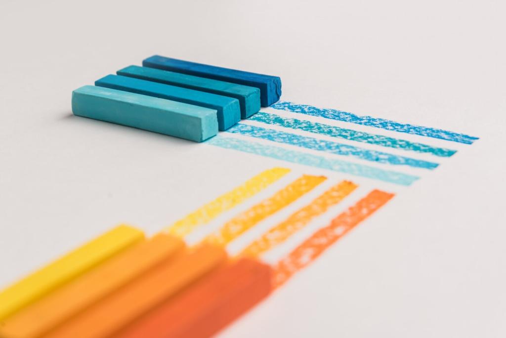
Complementary pairs sit directly across the color wheel, creating vibrant contrast and natural balance. Start with one dominant hue, then add the opposite in smaller touches to energize without chaos. Curious? Comment with your favorite pair.

Mastering the Color Wheel for Real Rooms

Undertones make or break complementary harmony. A cool blue sings with a warm copper, but can clash with a pinkish orange. Calm the pairing using soft grays, natural wood, or woven textures that bridge the temperature gap.

Living Rooms that Glow: Blue and Orange Done Right

Anchor with Blue, Spark with Orange

Choose a denim or navy sofa as the anchor, then sprinkle burnt orange in pillows, a throw, or a ceramic lamp. The cool base steadies the energy, while small orange hits deliver instant hospitality.

Patterns, Art, and Scale

Bring the palette together with patterned rugs, abstract art, and curated books. Keep scale varied: one bold piece, several medium accents, and tiny details. This rhythm prevents visual noise while spotlighting your complementary story.

A Cozy Conversation Corner: A Mini Makeover Story

We refreshed a dull corner by painting a soft blue alcove, adding a cognac leather chair, and an orange-stitched pouf. The space suddenly invited long talks over tea. Tell us your corner makeover dreams.

Restful Bedrooms: Red and Green, Softened and Layered

Sage and Terracotta Over Fire-Engine and Neon

Trade high-intensity hues for muted, earthy versions. Sage walls feel breathable and calm; terracotta textiles deliver warmth without shouting. The complementary relationship remains, but the volume drops to lullaby level for easy sleep.

Textiles that Whisper, Not Shout

Linen, brushed cotton, and wool add tactile softness that mellows complementary contrast. Mix small-scale prints with solids, and keep sheen low. Share your bedding palette ideas, and subscribe for our monthly bedroom moodboard guide.

Plants as Living Bridges

Greenery naturally supports the palette, connecting sage walls to terracotta pottery. A rubber plant, trailing pothos, or eucalyptus stems soften edges and introduce restorative scent. What plant completes your restful retreat? Comment below.

Energized Kitchens: Yellow and Purple with Purpose

Cabinets, Tiles, and the Sunshine–Eggplant Equation

Consider butter-yellow upper cabinets for brightness, grounded by eggplant tile or a plum-painted island. Keep counters neutral to avoid overload. The result: cheerful mornings, grounded prep work, and a hint of culinary theater.

Hardware, Stone, and Wood that Harmonize

Brushed brass bridges yellow and purple beautifully, while pale oak floors warm the scene. Choose stone with subtle veining that echoes both hues. The materials chorus keeps contrast refined and durable for daily life.

Morning Rituals: A Reader’s Story and Your Turn

A reader swapped bland beige for a sunny backsplash and mulberry stools. Coffee tasted brighter, and breakfasts lingered longer. What ritual would complementary colors transform in your kitchen? Share below and subscribe for renovation diaries.

Small Spaces, Big Impact: Complementary Color Tricks

Zoning with Color Blocks and Soft Gradients

Use a calm dominant hue for continuity, then block its complement to define a desk niche or dining edge. Feather edges with a gradient or textured wallpaper to avoid hard interruptions in tiny rooms.

Sightlines, Doors, and Echoed Accents

Repeat a small complementary accent along a sightline—door trim, a stool, a framed print—so the eye travels, not stutters. Consistent echoes create flow, making even narrow spaces feel curated and confident.

Ceilings, Baseboards, and the Perception of Height

Paint ceilings a lighter tint of the dominant color, then highlight baseboards in a softened complement. This gentle push-pull lifts the gaze and grounds the floor. Tell us your hallway trick in the comments.

Texture, Finish, and Tactility: The Sensory Side

Matte walls absorb light, taming bold complements; gloss amplifies contrast and highlights imperfections. Try satin on doors for durability and subtle sheen. Share your finish experiments, and subscribe for our finish-by-room checklist.

Texture, Finish, and Tactility: The Sensory Side

Jute rugs, clay vases, and limewash walls soften complementary edges with soulful irregularity. Handmade elements introduce micro-variations that feel human. These textures invite touch, inviting you to linger longer in your color story.

Light as Your Co-Designer

Warm bulbs flatter orange and terracotta, neutral bulbs balance blue and green, and cool bulbs sharpen purples. Layer ambient, task, and accent lighting. Which bulbs transformed your room? Comment your picks and subscribe for lighting guides.

Light as Your Co-Designer

North light cools, south light warms, and seasonal changes shift everything. Choose complements that still harmonize in winter gray and summer glare. Track light with photos, then adjust textiles seasonally for effortless resilience.
Silverloonpress
Privacy Overview

This website uses cookies so that we can provide you with the best user experience possible. Cookie information is stored in your browser and performs functions such as recognising you when you return to our website and helping our team to understand which sections of the website you find most interesting and useful.